Project
_
Clarity
_
Clarity
Services
_
Creative Direction
Brand Strategy
Digital Design
Guidelines & Design Systems
Iconography
Motion Design
Visual Identity
3D
_
Creative Direction
Brand Strategy
Digital Design
Guidelines & Design Systems
Iconography
Motion Design
Visual Identity
3D
Synopsis
_
Clarity debuts a groundbreaking decentralized algorithm for credit risk, targeting a broad audience looking to improve their credit scores via cryptocurrency. The aim is to create the world's most trustworthy, inclusive, and diverse credit rating system, making credit accessible to all. This initiative addresses the challenges and opacity of conventional credit systems, which often compromise user data, by offering a more transparent, simple, and universally accessible approach.
The design concept of Clarity is anchored in 'transparency,' ensuring ease of understanding and visibility.
The new brand identity centers on a simplistic logomark, comprising a square and a circle. These shapes, when animated, evolve into 3D forms that represent insight and the ethos of transparency. The square/cube symbolizes the blockchain and its protocols, while the circle/atom array illustrates clarity and perception.
The brand's visual language includes custom icons, graphic patterns, and 3D designs stemming from the logomark, ensuring a cohesive visual language. A striking black, white, and opal gradient color palette has been chosen for its simplicity and adaptability.
The Söhne Breit typeface from Klim Type Foundry plays a critical role in the identity, promoting clear and confident communication on all fronts.
Overall, the comprehensive branding guidelines showcase Clarity's commitment to simplicity, clarity, and innovation in its identity and communication.
_
Creative direction, brand identity, and digital design for a Web3 lending platform.
Clarity debuts a groundbreaking decentralized algorithm for credit risk, targeting a broad audience looking to improve their credit scores via cryptocurrency. The aim is to create the world's most trustworthy, inclusive, and diverse credit rating system, making credit accessible to all. This initiative addresses the challenges and opacity of conventional credit systems, which often compromise user data, by offering a more transparent, simple, and universally accessible approach.
The design concept of Clarity is anchored in 'transparency,' ensuring ease of understanding and visibility.
The new brand identity centers on a simplistic logomark, comprising a square and a circle. These shapes, when animated, evolve into 3D forms that represent insight and the ethos of transparency. The square/cube symbolizes the blockchain and its protocols, while the circle/atom array illustrates clarity and perception.
The brand's visual language includes custom icons, graphic patterns, and 3D designs stemming from the logomark, ensuring a cohesive visual language. A striking black, white, and opal gradient color palette has been chosen for its simplicity and adaptability.
The Söhne Breit typeface from Klim Type Foundry plays a critical role in the identity, promoting clear and confident communication on all fronts.
Overall, the comprehensive branding guidelines showcase Clarity's commitment to simplicity, clarity, and innovation in its identity and communication.


Project
_
Tetraka
_
Tetraka
Services
_
Art & Design
Creative Direction
Design Systems
Experiential Design
Visual Programming
_
Art & Design
Creative Direction
Design Systems
Experiential Design
Visual Programming
Synopsis
_
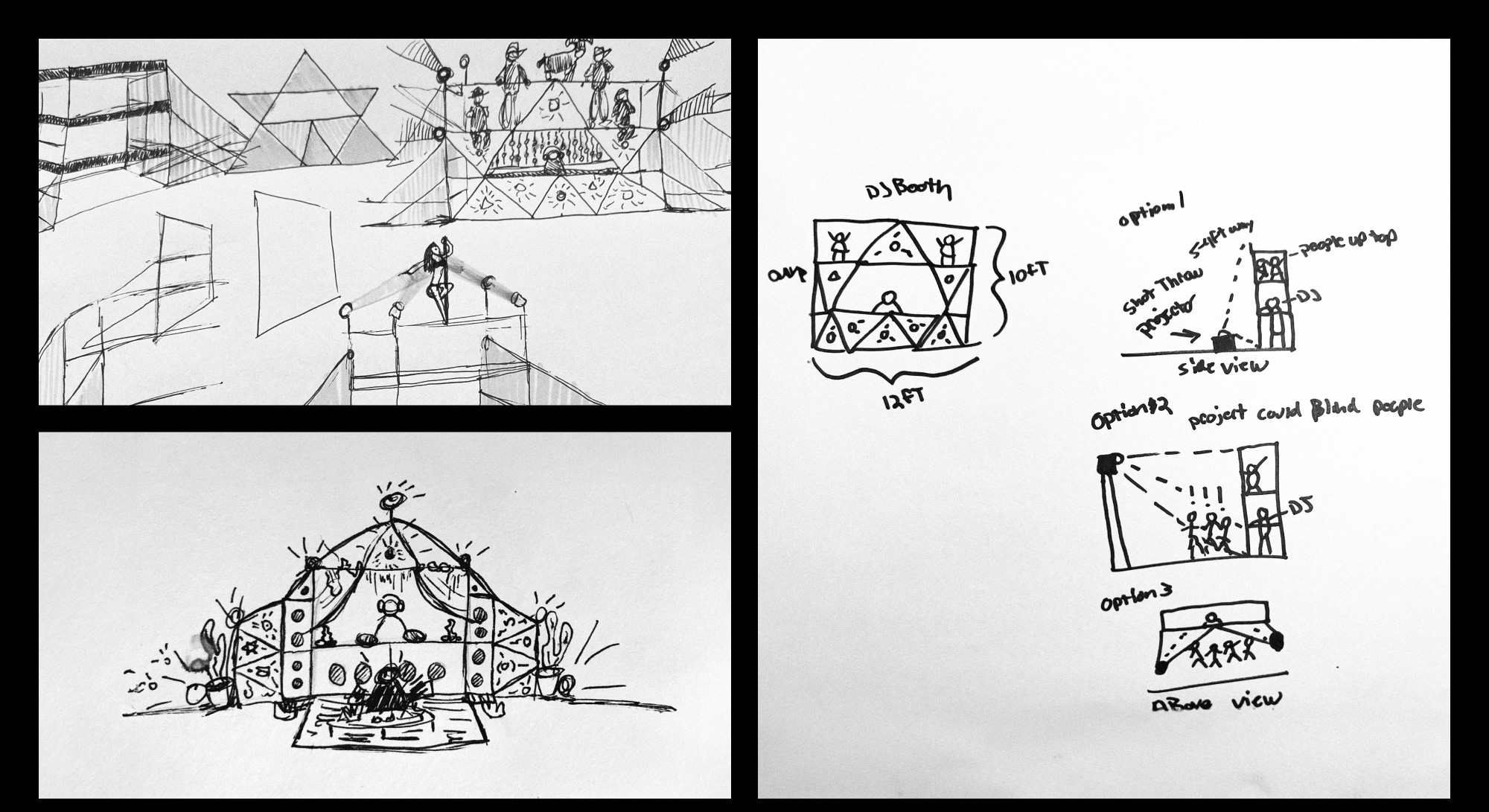
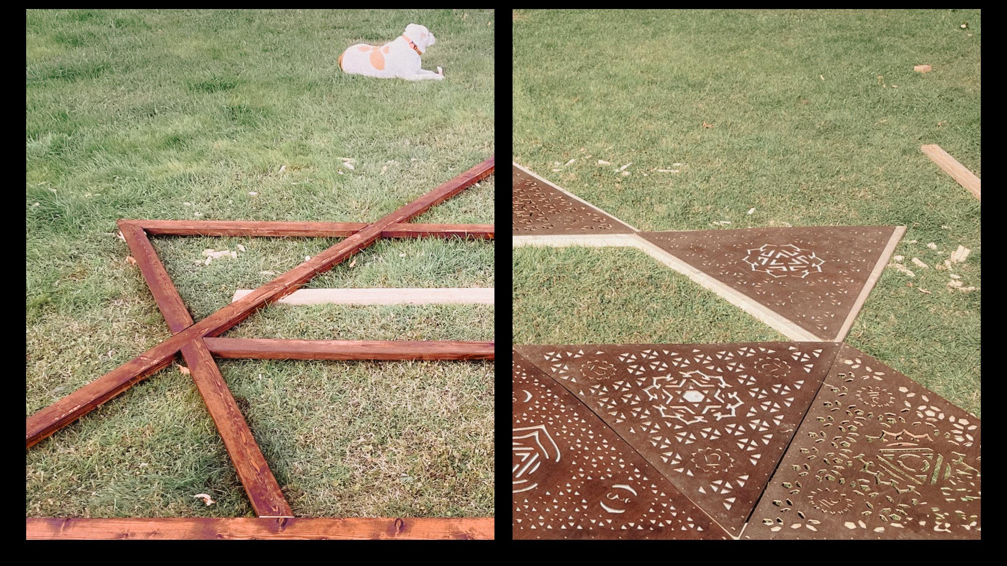
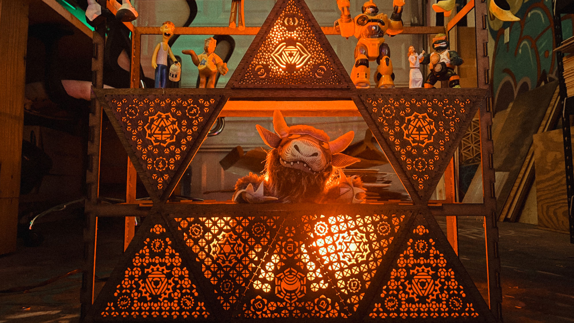
An interdimensional temple of art and sound.
The Tetraka is a temple-like stage inspired by the Merkabah, designed as a fusion of light, sound, and interactive tech. Its structure features laser-cut patterns, LED illumination, and multi-layered projections, synchronized in real time with musicians or performers to create a hypnotic experience.
More than just a stage, it’s a multi-level audiovisual environment where sound frequencies and kinetic visuals create an evolving journey. Each "Tetrakon" level introduces new characters and textures, playing with contrasts of between the organic, the extraterrestrial, and the synthetic.
Built for live artists of all disciplines, including musicians, visual performers, and digital creators, the Tetraka is a platform for collaborative experimentation. By merging physical design with reactive digital elements, it redefines how audiences engage with performance.
_
An interdimensional temple of art and sound.
The Tetraka is a temple-like stage inspired by the Merkabah, designed as a fusion of light, sound, and interactive tech. Its structure features laser-cut patterns, LED illumination, and multi-layered projections, synchronized in real time with musicians or performers to create a hypnotic experience.
More than just a stage, it’s a multi-level audiovisual environment where sound frequencies and kinetic visuals create an evolving journey. Each "Tetrakon" level introduces new characters and textures, playing with contrasts of between the organic, the extraterrestrial, and the synthetic.
Built for live artists of all disciplines, including musicians, visual performers, and digital creators, the Tetraka is a platform for collaborative experimentation. By merging physical design with reactive digital elements, it redefines how audiences engage with performance.


Project
_
Cubelisk
_
Cubelisk
Services
_
Art & Design
Creative Direction
Experiential Design
Visual Programming
_
Art & Design
Creative Direction
Experiential Design
Visual Programming
Synopsis
_
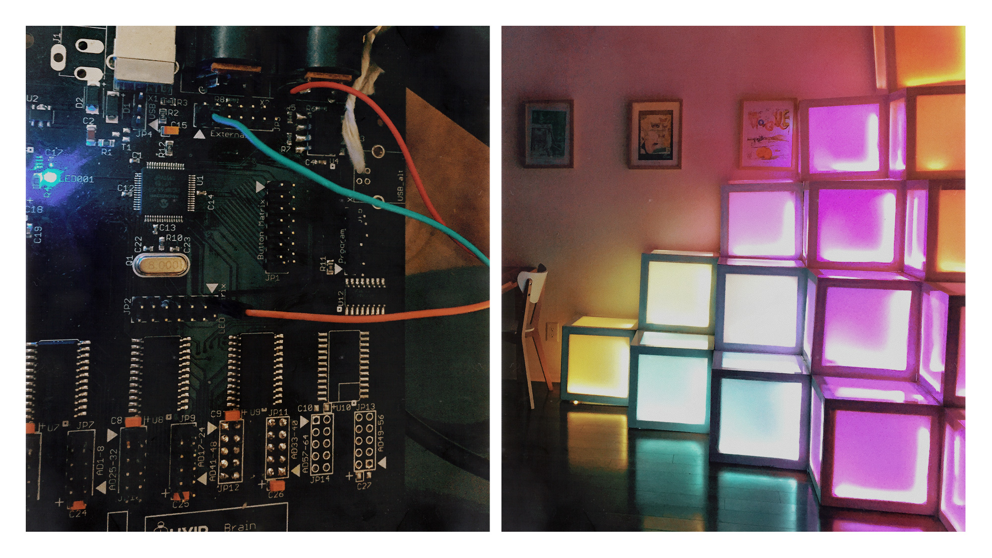
Cubelisk consists of two main structures: The Cubes and The Obelisk. The Cubes are a set of 15 acrylic backlit cubes that serve as the canvas for visual expression, while The Obelisk acts as an interactive command pillar.
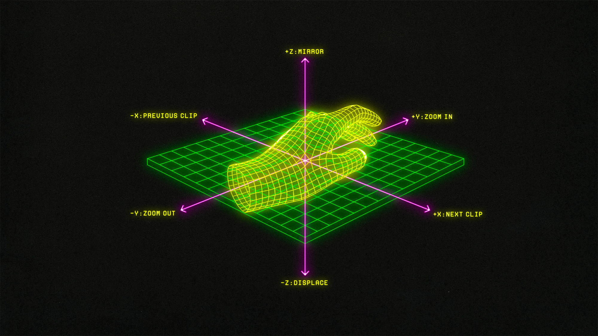
The Obelisk features three core components—a motion sensor, a projector, and MIDI hardware—designed to enable users to control, create, and transform the visual content and lighting on the cubes through intuitive hand movements.
The purpose of Cubelisk is to engage viewers in a unique sensory experience that evokes exploration, creativity, and technology. This installation invites users to interact directly with the art, fostering a dynamic environment where technology meets creativity.
_
An interactive multimedia art installation that lets users create with the palm of their hand.
Cubelisk consists of two main structures: The Cubes and The Obelisk. The Cubes are a set of 15 acrylic backlit cubes that serve as the canvas for visual expression, while The Obelisk acts as an interactive command pillar.
The Obelisk features three core components—a motion sensor, a projector, and MIDI hardware—designed to enable users to control, create, and transform the visual content and lighting on the cubes through intuitive hand movements.
The purpose of Cubelisk is to engage viewers in a unique sensory experience that evokes exploration, creativity, and technology. This installation invites users to interact directly with the art, fostering a dynamic environment where technology meets creativity.


Project
_
Marks
_
Marks
Services
_
Creative Direction
Visual Identity
Logo Design
_
Creative Direction
Visual Identity
Logo Design
Synopsis
_
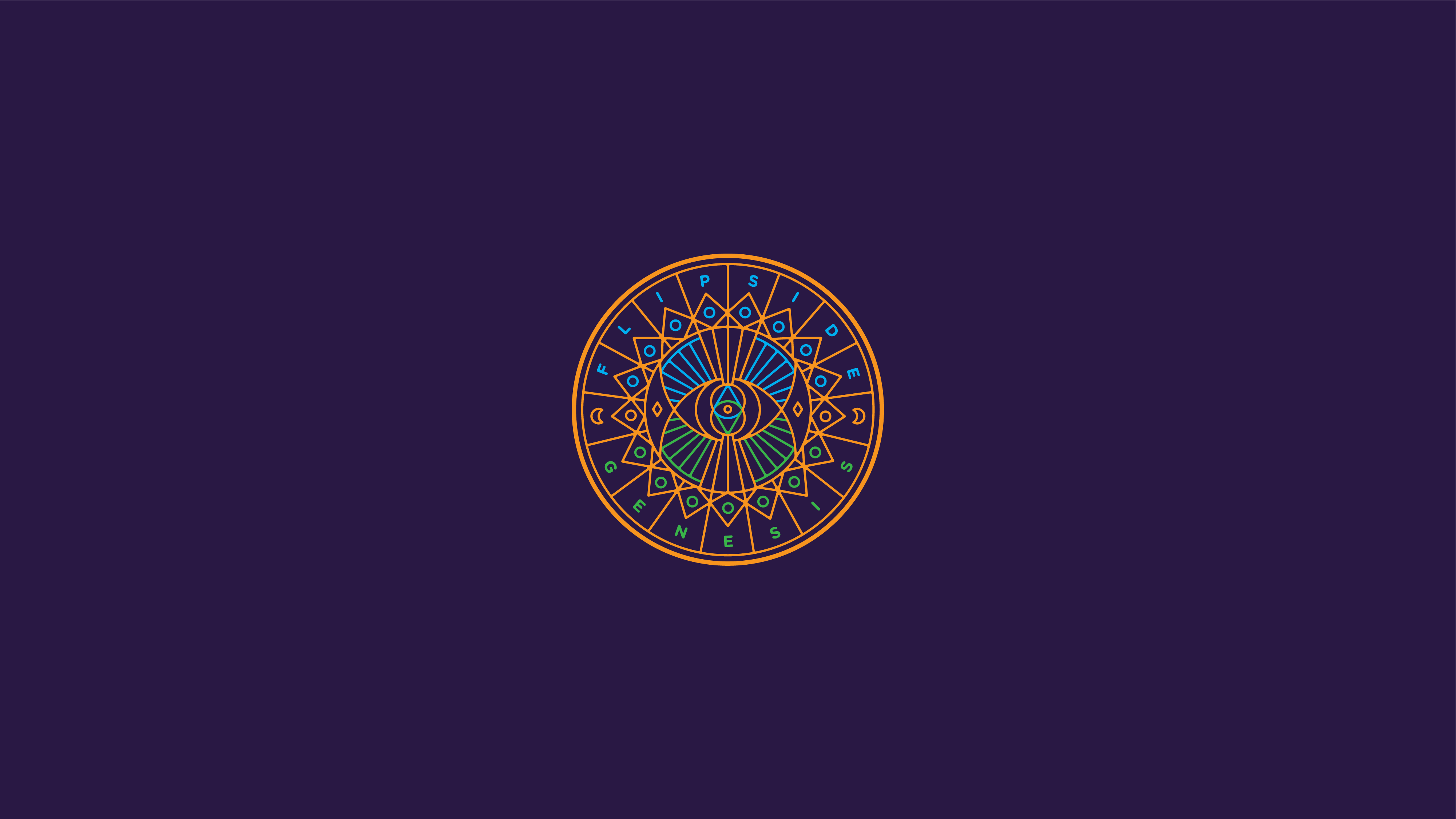
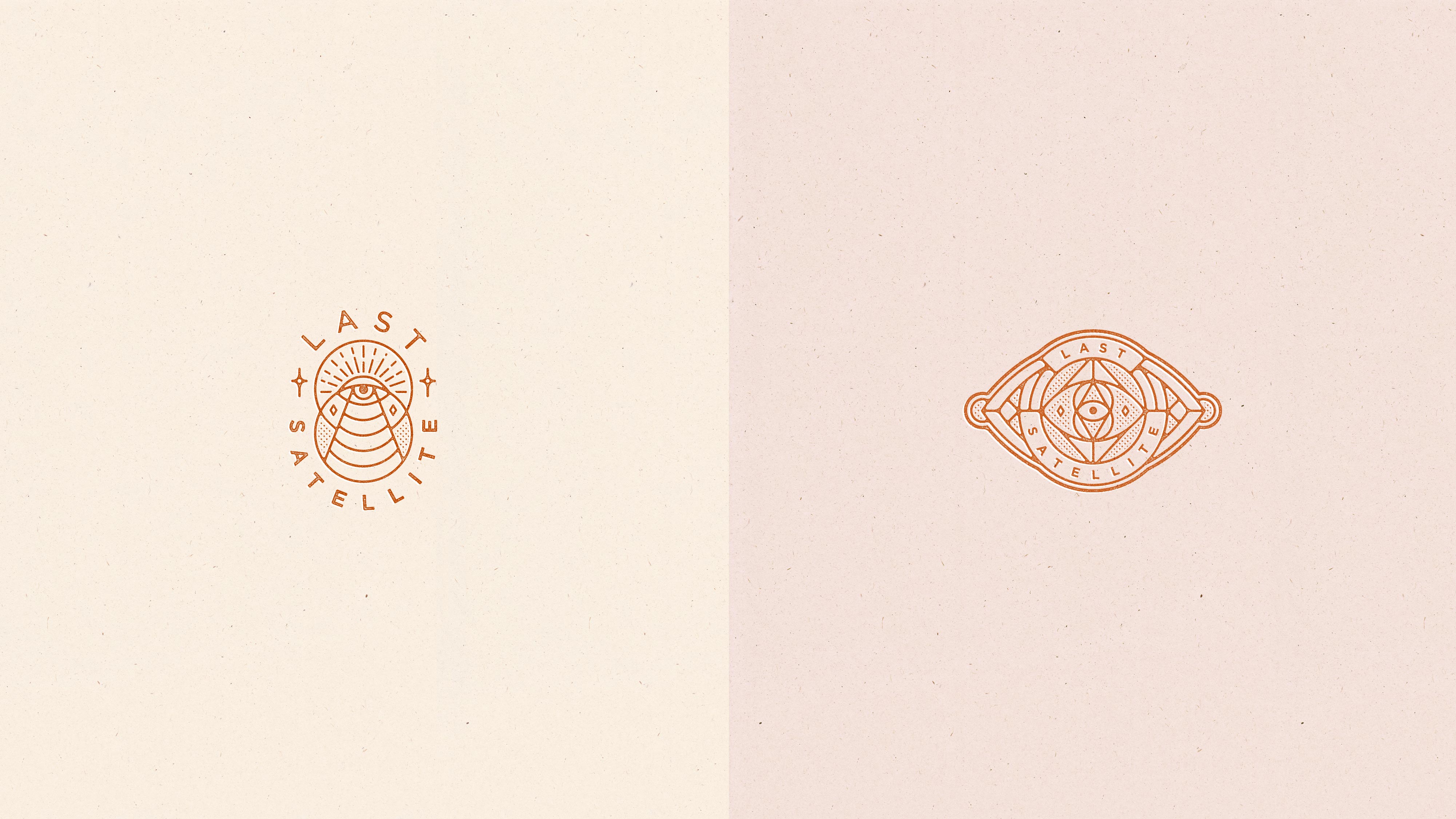
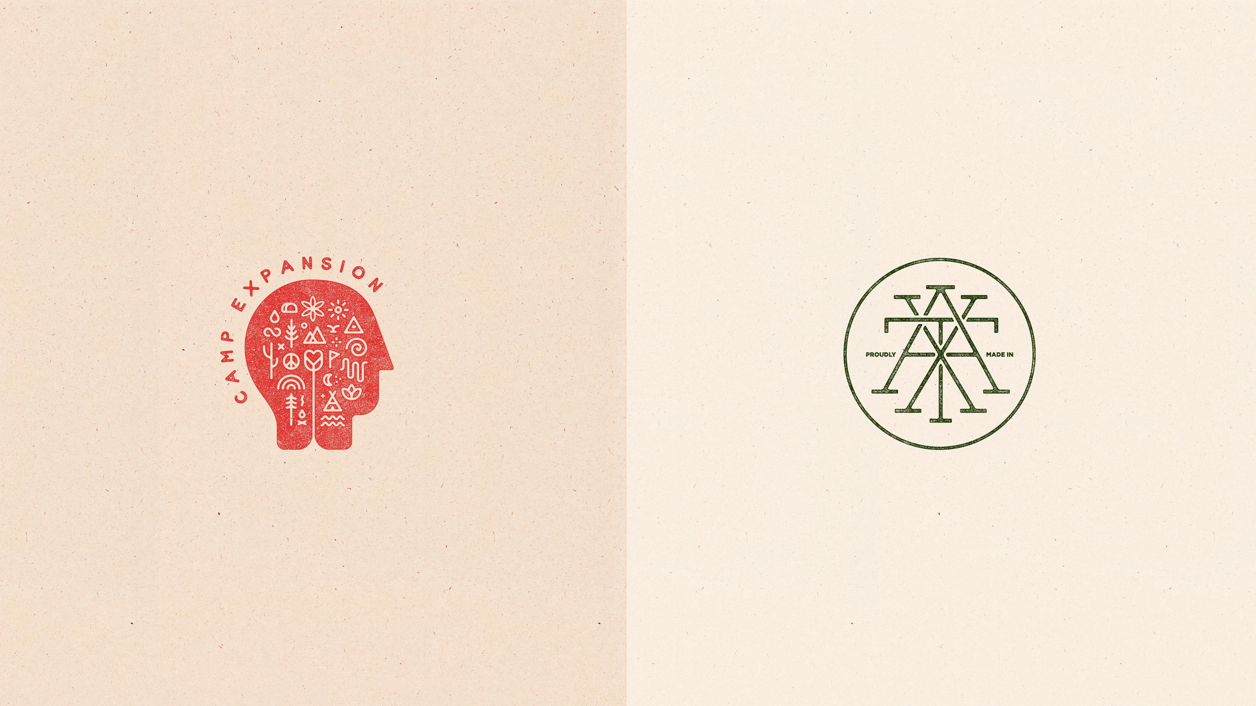
A collection of marks, symbols, and icons designed to capture the core idea and feeling of a brand. These marks find the balance between being distinctive and simple, as well as uncomplicated but not generic. Remember, these marks are not about communication; they are about identification.
_
A collection of marks, symbols, and icons designed to capture the core idea and feeling of a brand. These marks find the balance between being distinctive and simple, as well as uncomplicated but not generic. Remember, these marks are not about communication; they are about identification.


Project
_
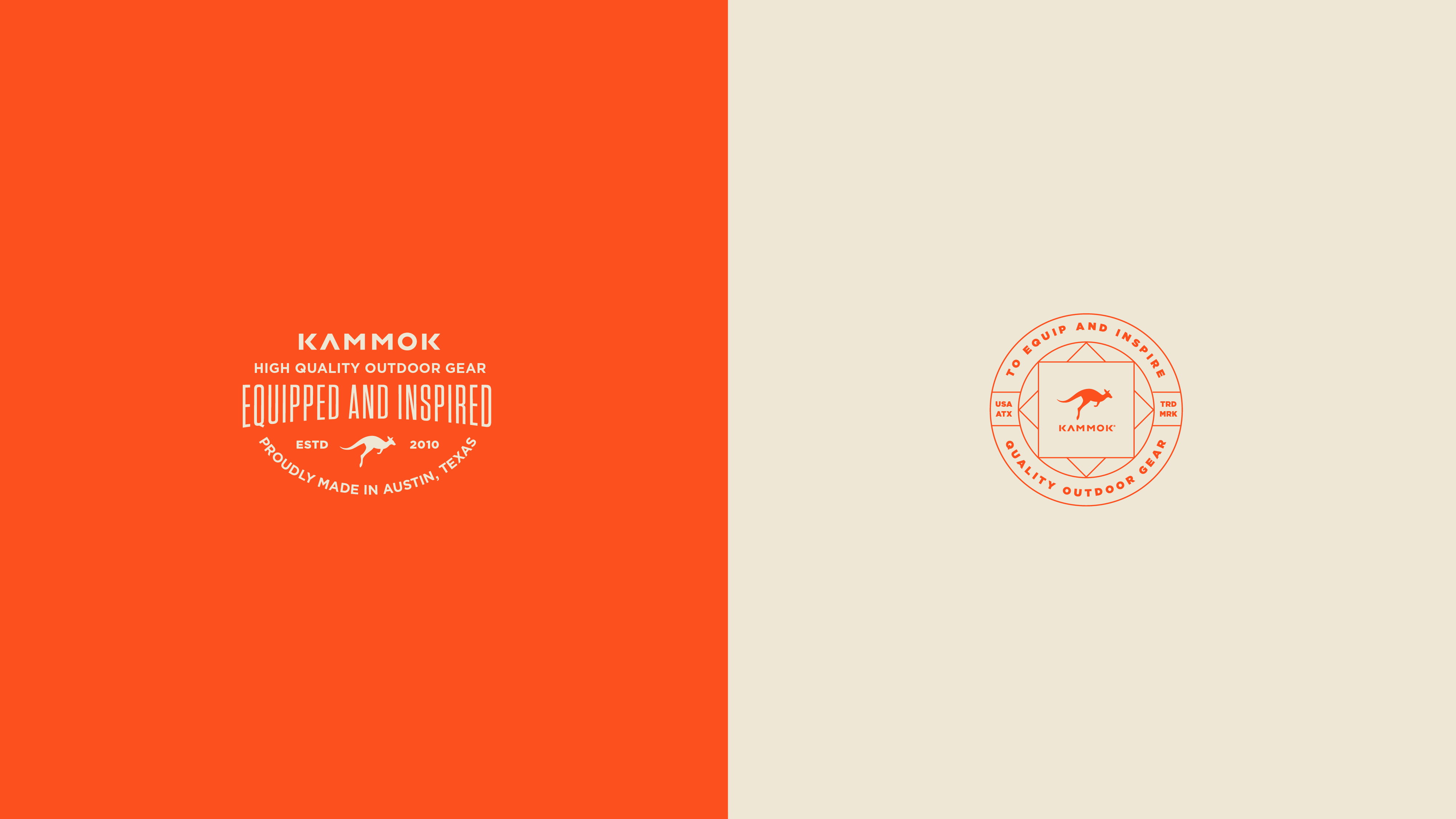
Logos
_
Logos
Services
_
Creative Direction
Visual Identity
Logo Design
_
Creative Direction
Visual Identity
Logo Design
Synopsis
_
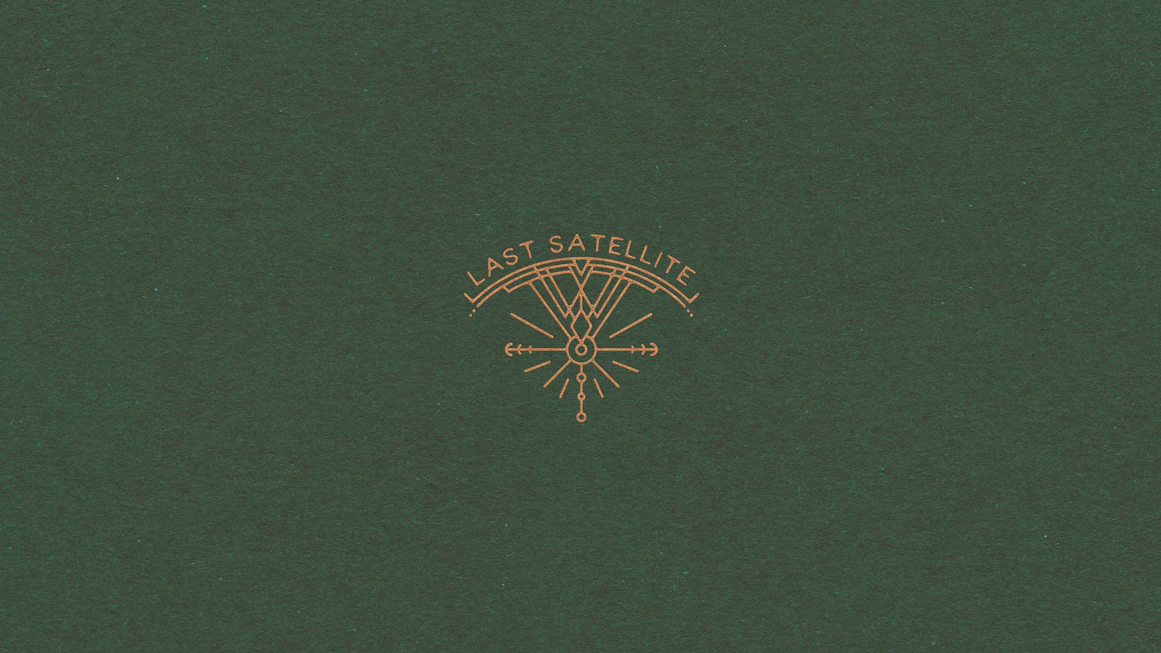
A collection of logos that effortlessly combine a unique logotype with a meaningful logomark, creating the ultimate representation of a brand's identity. A thoughtfully designed lockup not only strengthens the connection between these elements but also guarantees a cohesive and unified visual presence, bringing the brand's identity to life with harmony and style.
_
A collection of logos that effortlessly combine a unique logotype with a meaningful logomark, creating the ultimate representation of a brand's identity. A thoughtfully designed lockup not only strengthens the connection between these elements but also guarantees a cohesive and unified visual presence, bringing the brand's identity to life with harmony and style.