Project
_
Kammok
_
Kammok
Services
_
Brand Strategy
Experiential Design
Guidelines & Design Systems
Product Design
Packaging
Retail Design
Stationary
Visual Identity
_
Brand Strategy
Experiential Design
Guidelines & Design Systems
Product Design
Packaging
Retail Design
Stationary
Visual Identity
Synopsis
_
Kammok enlisted my services to develop a distinct brand identity, enabling them to stand out in the highly competitive outdoor industry. My role was extensive, encompassing all facets of brand visibility and customer interaction, from strategic planning to product design. I focused on embodying Kammok's ethos of clean technical design, adventurous spirit, and community focus across all points of contact.
Initially, the choice of a kangaroo, native to Australia and not Texas, as their mascot seemed unconventional. However, the kangaroo symbolizes comfort and support, akin to the function of both kangaroo pouches and hammocks. This mark serves as a dynamic and unique representation, setting Kammok apart from its rivals.
The logotype, a modified version of Klavika by Eric Olson from Process Type Foundry, plays a crucial role in their identity, exuding simplicity, technical sophistication, and confidence in all messaging.
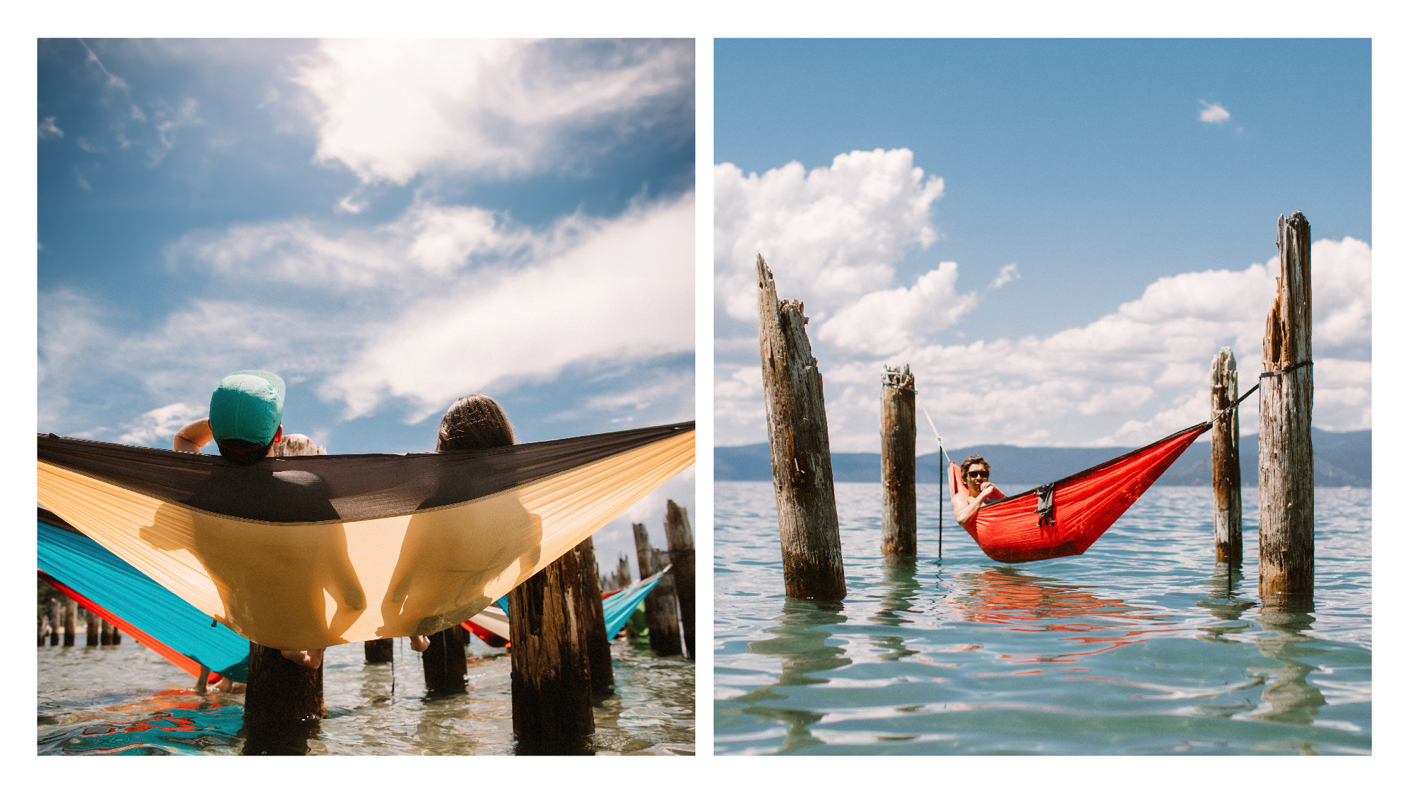
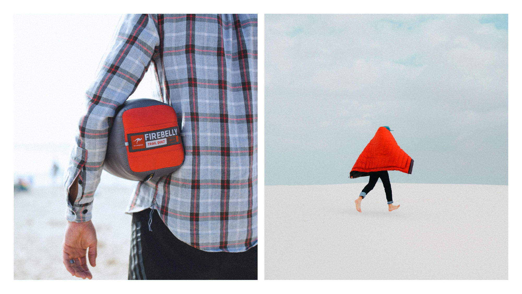
Authentic photography showcasing real people in natural settings is integral to the brand's revamped identity.
Kammok's branding predominantly features radiant orange, with the redesign establishing this as the main brand color. A rich secondary palette includes flora and fauna colors like gold, blue, green, and purple.
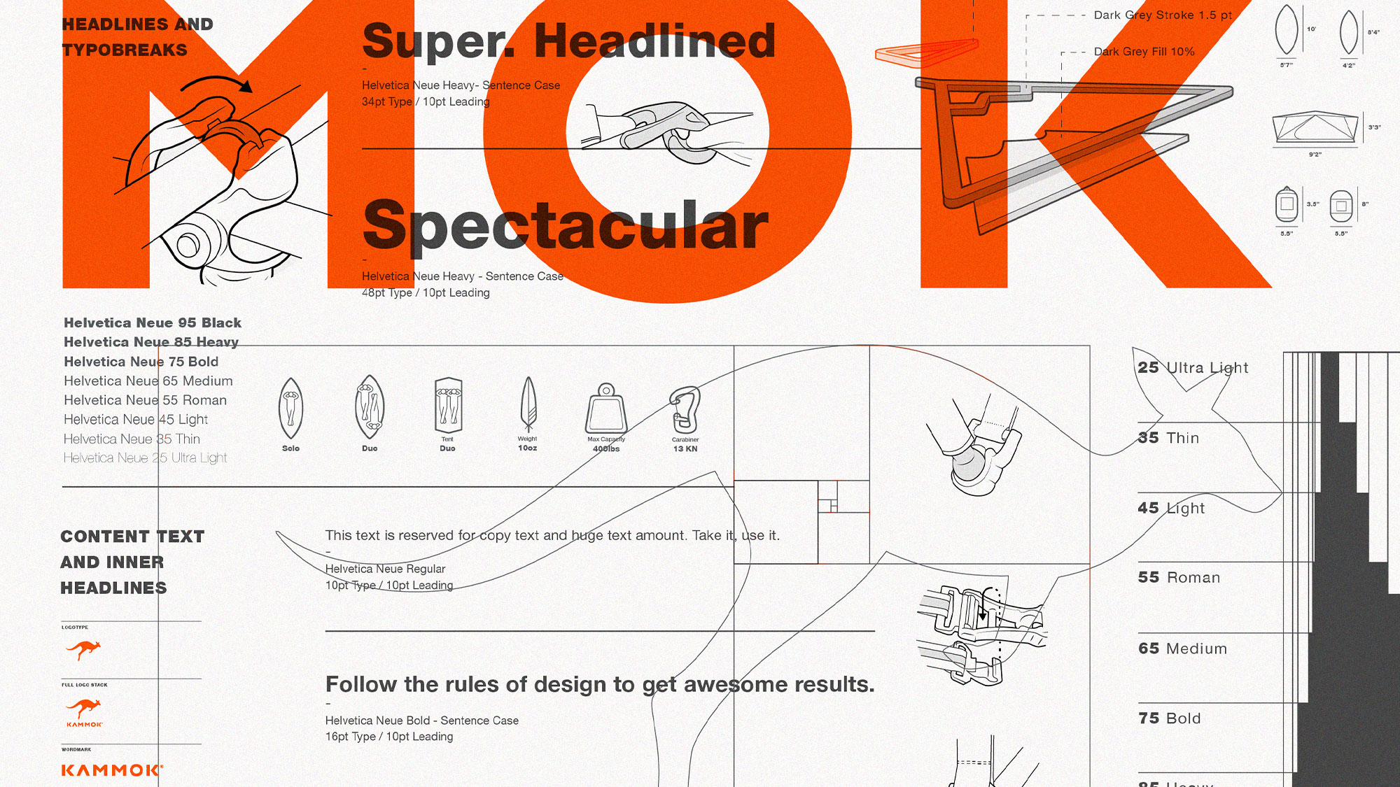
For packaging and other uses, the modern, industrial Helvetica typeface was chosen for its versatility and neutral expression, adaptable to various design scenarios.
The packaging design emphasizes minimal material use, incorporating stronger, lighter fabrics, cleaner chemicals, and recycled materials wherever feasible, to reduce environmental impact and enhance product longevity.
Having provided comprehensive guidelines, I maintain a close collaboration with Kammok to ensure the brand's rollout remains consistent, clear, and impactful.
_
Brand identity, design systems and product design for a company that creates high quality outdoor gear and apparel.
Kammok enlisted my services to develop a distinct brand identity, enabling them to stand out in the highly competitive outdoor industry. My role was extensive, encompassing all facets of brand visibility and customer interaction, from strategic planning to product design. I focused on embodying Kammok's ethos of clean technical design, adventurous spirit, and community focus across all points of contact.
Initially, the choice of a kangaroo, native to Australia and not Texas, as their mascot seemed unconventional. However, the kangaroo symbolizes comfort and support, akin to the function of both kangaroo pouches and hammocks. This mark serves as a dynamic and unique representation, setting Kammok apart from its rivals.
The logotype, a modified version of Klavika by Eric Olson from Process Type Foundry, plays a crucial role in their identity, exuding simplicity, technical sophistication, and confidence in all messaging.
Authentic photography showcasing real people in natural settings is integral to the brand's revamped identity.
Kammok's branding predominantly features radiant orange, with the redesign establishing this as the main brand color. A rich secondary palette includes flora and fauna colors like gold, blue, green, and purple.
For packaging and other uses, the modern, industrial Helvetica typeface was chosen for its versatility and neutral expression, adaptable to various design scenarios.
The packaging design emphasizes minimal material use, incorporating stronger, lighter fabrics, cleaner chemicals, and recycled materials wherever feasible, to reduce environmental impact and enhance product longevity.
Having provided comprehensive guidelines, I maintain a close collaboration with Kammok to ensure the brand's rollout remains consistent, clear, and impactful.


